Within the pressure of 21st Century Healthcare, it is increasingly clear that the current health IT market needs major improvement. In particular we know that usability of current health IT systems is a real problem for many clinicians at the frontline, with moves such as the LetDoctorsBeDoctors campaign highlighting the poor "EHR state of mind" and inadequacies of the current state of the Health IT market.
As we build towards an open platform stack we acknowledge that usability and integration are our first and second guiding principles of our technical approach. In a previous article we took a high level view of our PulseTile UI framework. We are now going to step "into the mind" and explain the rationale behind this user-centred design.
We have, in our earlier UI/UX post, explored the three key levels within our stack, aimed at:- Single Person Views
- Multiple Person Views
- Clinical/Business Intelligence Views
- North - for Context: where is the user,where to search
- West - for Navigation: how to move around the application
- Centre - for Summary/tables on key information
- East - for Detail of any/all patient information

In the context of our PulseTile implementation of this design pattern we can see these principles in action:
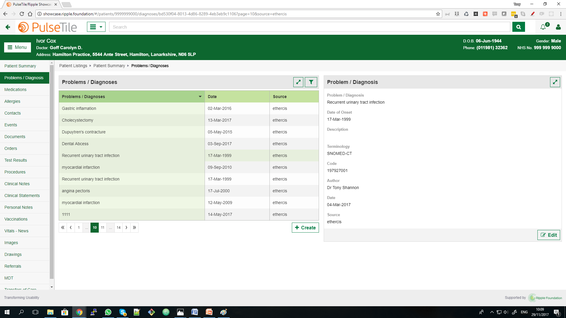
North - Context Person Banner, based on the work of the NHS Common User Interface effort, with easy to read person/patient information
West - Navigation The person/patient record can become a large and complex thing so we have structured the record in line with those key headings that most closely relate to the core clinical process, as those of us were taught in medical school will recognise.
- Problems/Diagnosis
- Medications
- Allergy/Adverse Reactions
- Orders
- Results
- Procedures etc etc
Centre - Summary This table approach allows us to offer a brief summary view of key data (Problems/Diagnosis, Medications etc) at a glance, with just enough information to be useful but not too much. Here we provide a simple filter to allow quick searching through the tables. At the bottom of the table is the option to create/add further data. This is a key design point, the user is encouraged to explore existing information before adding further detail. As integration is built into the design philosophy, the existing information from a range of existing systems may be available here, along with the source system, which gives important information about the provenance of the information available. This is useful on two counts.
- Firstly it is easier and faster to read information than enter it de novo, so encouraging this good practice engenders more efficient information management.
- Secondly it aims to reduce any unnecessary duplication of medications, investigations etc, by ensuring existing patient information is made available at the point of care.
East - Detail In this panel any/all detail can be made available to the clinician. Much of the time this information will be read only, though occasionally the data may be editable from this point (via Edit button which triggers the related Edit view to appear).
Edit/Modal- Data Entry/Edit For data entry/edit purposes, we have done work on both an Inline and Modal approach to Edits for real time entry/editing. We've explored these options for two reasons:
- An Inline approach allows us to accommodate most all of our needs within our current UX framework in a neat and tidy way and seems to work well.
- A Modal approach also allows us to accommodate a wide range of UI widgets for the challenging of effective data entry, including external components.
- A Modal approach may allow us to hook/harness any number of UI widgets together in any particular sequence to accommodate the diversity of clinical pathways seen in healthcare.
As you can see, we are continually reviewing and refining the approach to improve the PulseTile UX framework.
Hopefully further detail on the rationale behind our UI framework helps explains the simple yet scalable principles involved in the PulseTile UX/UI framework. Simply put the approach borrows heavily from many web applications that we use day in and day out (e.g. GMail as just one example ) to minimize the need for training yet is able to handle both access to legacy data plus de novo data entry.
We outline and offer this open source framework as a generic UX/UI framework for healthcare IT application purposes, to encourage further development and redevelopment. Feedback of all sorts is very welcome. Indeed if/when you identify a more flexible open source UI framework for healthcare please do let us know!