As we build towards an open platform in healthcare, one of the main drivers behind our approach is to get stuff out there that folk can see, touch and work with. The principles of User Centred Design and Agile Development are key to our philosophy and way of working. Having been involved in related projects for many years, one of the key issues we know is crucial to better healthcare IT is the importance of usability. In fact, in my opinion (and several other colleagues I know) it’s the number one issue to get right in health IT.
In an earlier article on "21st Century Healthcare, the Open Platform that will Transform" of the three key features listed: - Usability, Integration and Clinical Kernel - Usability was the first priority. Its fair to say that usability has not been a strong feature of health IT and one can even cite the unusual arrangement with "Hardship Exceptions" in the US Health IT market to illustrate the major issue/problem this is for many users.
Indeed, within the US, an industry of scribes has grown and proliferated to support clinicians at the frontline as the process of clinical documentation into EHR systems has become so cumbersome that doctors need an assistant to support them. This raises a raft of people, process and technology issues that I've explored elsewhere but it suffices to say health IT usability (that is the User Interface UI and User Experience UX) could be much better.
If Steve Jobs were still around…
If the late, legendary Steve Jobs was still on the planet, I think someone of his ilk could help us strip down this challenge and change the healthcare world, much as other industries have been transformed. Healthcare is waiting for the right, highly usable platform that makes this all so much easier.
Of course this is non trivial to do, otherwise it would have been cracked by now. In my own opinion, many of the previous attempts to tackle this have over complicated their analysis and the related solutions, which then look busy, cluttered and hard to navigate. Some have taken bits of this challenge and undertaken very nice work to address part of the solution (eg NHS Common User Interface or Healthcare Design Challenge efforts). These look good in isolation but don't form or offer a holistic whole, a user interface framework that can be a key part of the platform that healthcare needs.
Introducing the PulseTile UX framework
So where better to start exploring the open platform of the future than at the front end, the User Interface framework, the look and feel.
With the challenge of great usability in mind, we have set about our agile efforts with our Ripple platform demonstrator. Building on learning from several phases of earlier work (including PPM+, Leeds Care Record, ClinUiP, and NHS VistA), we have quickly developed and deployed our PulseTile UX framework as central to our mission.
The principles behind the framework are very simple - deliberately so and can be explained as follows:
The simplicity of the approach is based on a set of key patterns that we have learned from our time in this field. Patterns are key to understanding complex adaptive systems such as healthcare and healthcare IT. If the right patterns are spotted they can be harnessed to powerful effect.
So lets talk patterns
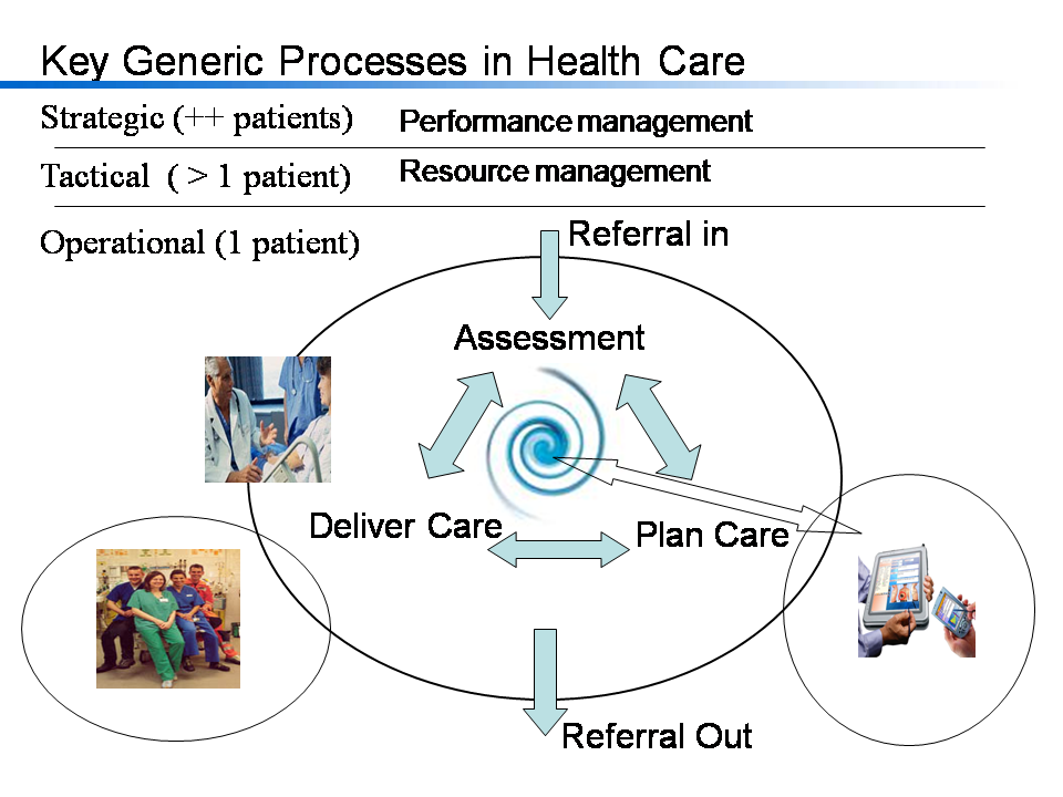
The PulseTile UX framework ties three key levels of people/process/info tech into three key layers.
I've also used a picture before to explain these three layers in healthcare.

For too long, the people, process and information technology between these three layers have been either kept apart and/or not worked well together or indeed the focus has been on one aspect to the detriment to the others.
In many places different teams use different processes and different tools to address these issues and very little is seamless. In other places, the focus may have been on aggregating information for billing or performance management, which has involved an army of staff digesting paper notes to feed this management reporting, while the frontline staff struggle with the same paper based tools.
A day in the life of one Clinician and three Clicks
So imagine this:
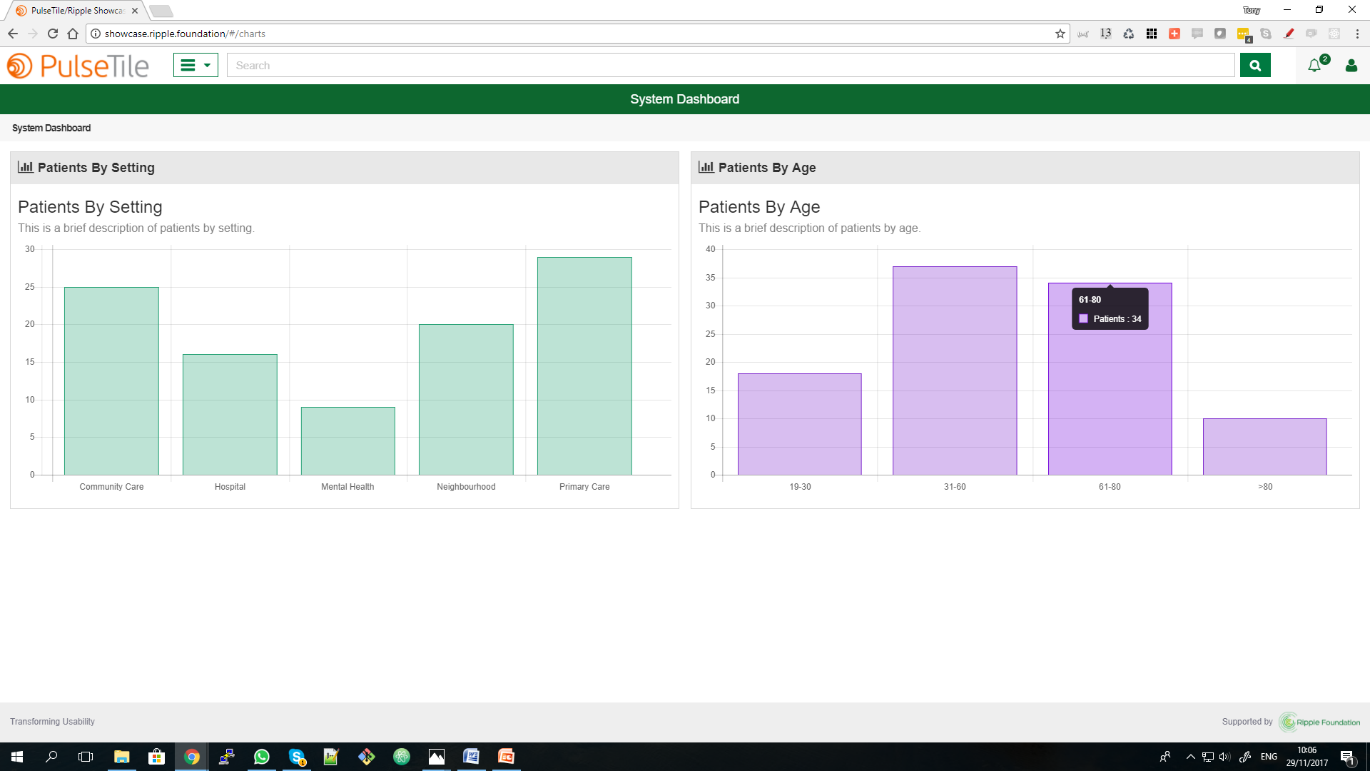
A senior clinician (doctor, nurse or other care professional) starts her week by looking at the community based service she leads and is responsible for (e.g. older Patients over 65 years old), she should be able to see the capacity of and demands on that service in real time. How else can she lead it and oversee it?

With the right tools she can see where the main pressures point are and where she needs to focus her attention. With one click she should be able to see a related view of each patient journey.
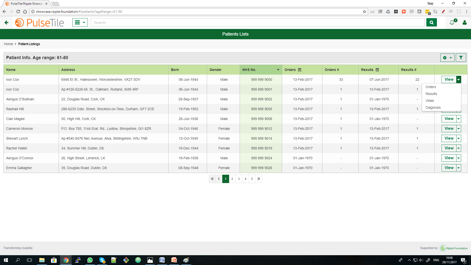
Imagine that same clinician overseeing the service starts her day in a clinical area of older patients that is under pressure and is able to look across that cohort of patients at different stages of the treatment and assessment of their condition, and because the same tool provides real time information about that particular group of patients, she can pick out the most in need of her attention.

With one click she can to see a view of that patient’s condition and care.
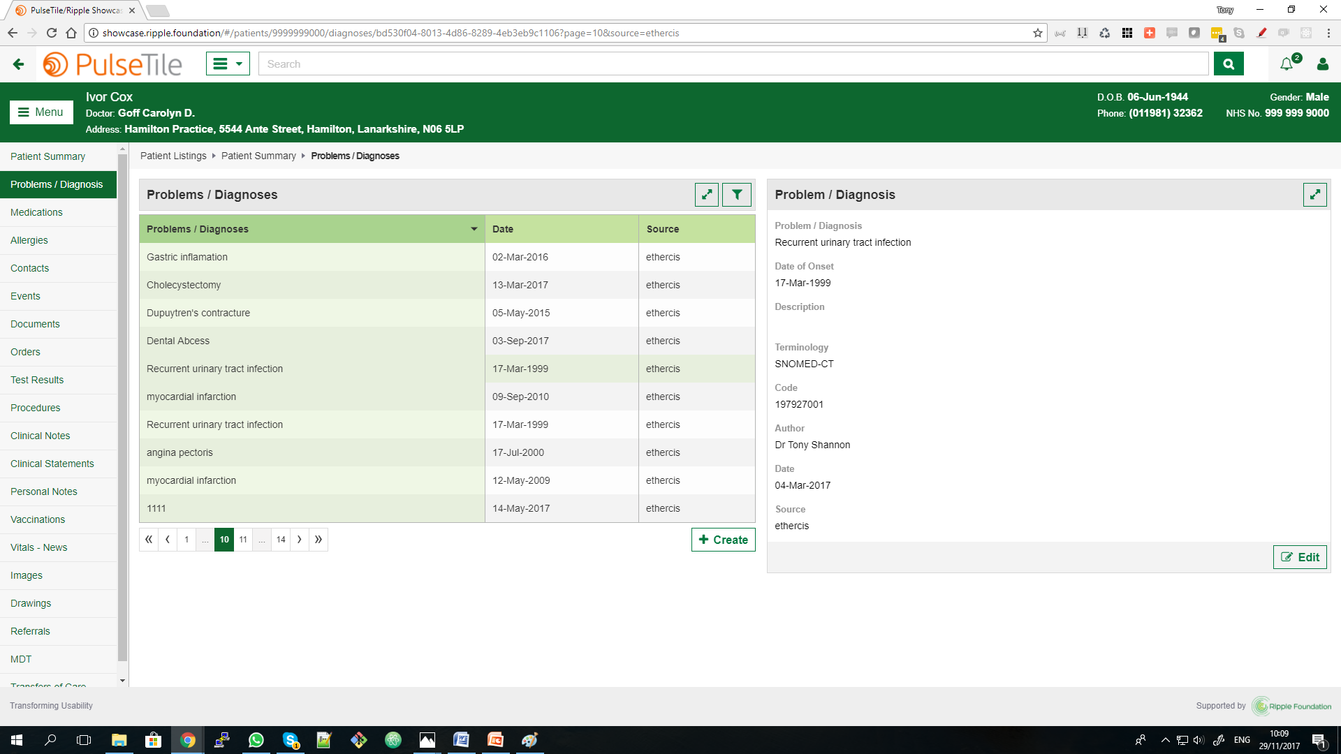
Finally, that same clinician approaches the patient, sits with her, introduces herself and begins to talk to the lady about her own story. The clinician has the information tools to examine the patient’s past medical history, her medications, allergies, clinic letters and much more, pulling related information from across the care system to ensure she is well informed as she takes over the patient’s care. If she needs further investigation (e.g. a blood test), treatment (e.g. a medication) or a referral to a colleague it will be only a click away.

These principles and the three clicks help explain the first three patterns behind our PulseTile UX/UI stack. As a picture tells a 1000 words we've include just three related screenshots to bring that theory and story to life.